Showing posts with label Contests. Show all posts

Behind the Camera: Photo Competitions


Welcome back for another installment of my Behind the Camera series.  In these entries, I will highlight a certain aspect of my photography and the topic is usually selected from a question that I have received over the previous month.  I'm going to do something a little different this time, however.  You see, the first of the month coincides rather conveniently with the start of the Dixie Classic Fair here in Winston Salem, NC.  This is something that I have participated in for a total of seven years since 2005.  It is the only contest that I regularly enter, and I have learned quite a bit from it over my years participating.

With this contest spending so much time in my head recently, I figured that this would be a great opportunity to speak about contests and what they mean to a photographer, and I'm sure any other artistic medium.  Contests are always an interesting topic and there are some very wide views on their relevance and importance.  I've run the gamut in my own personal experiences with contests over the years, and have come to a conclusion.  Contests can be fun for the thrill, but they are always a learning opportunity more than a validation of your own work.  What I mean is this, your goal should not be to win the contest, but to learn to view your own work more critically.  Of course we go in hoping to win, but one thing that I have found is that the only part of a contest that you can control is your own entry.  Beyond that, nobody knows what the judges will be looking for, nor what the other entries will bring to the table.  Contests are in essence a contest with yourself to find your best work that fits the character of the particular contest.  This is where you win or lose, the results of the contest are largely ceremonial and will likely come with dissension among those who have opinions on the entries.

With that out of the way lets take a look at what goes into selecting images for a contest.  This varies widely from artist to artist, so what I am going to talk about here only applies to my process.  The first step is determining what contest to enter.  There are a lot of them out there, and you have to be really selective in what contests to enter.  Many of the ones that are based online are ploys to get stock photography for a website/company.  What I mean with that is say you are submitting pictures for a calendar.  The company that publishes the calendar also publishes other items.  You submit your picture hoping to be featured in the calendar, and sign a licensing agreement that states something along the lines of you allow the company to reuse your image for this purpose and that purpose related to the contest, and for other promotional material.  If you aren't really careful, you will sign away your rights to that image while in their control.  This leaves them the ability to use it for whatever they want in many cases without any further compensation for you.

The other type of contest I have seen is one where you submit the image, and get notified that your image is among the best of the best and will be featured in a coffee table book which you can purchase for the nominal fee of $50.00 or something similar.  These contests usually have large prize money purses attached to them for the winners, and you have to pay to enter the contest.  These contests are money makers for the ones holding the contest with entries more than paying for the prize money, and then you have the book sales that many will do after receiving notification that they are finalists.  You should never have to purchase a book at full price where you are a contributor.  These folks are preying on a photographer's desire to get published.

I actually inadvertently stumbled into this type of contest earlier this year.  It was the Photographer's Forum magazine, 2018, Best of Photography contest.  I saw an add for it in an Outdoor Photographers magazine which is a very reputable publication.  I started to look at the website for the Photographers Forum and found some very quality images presented.  I looked at the contest which was a yearly thing, and looked very legit.  I perused through previous year's winners and thought that they had a wide variety of subject matter, much of which I shot.  Since this was a legitimate magazine, and it was sponsored by a reputable lens maker I decided to enter a handful of images based on what I had seen winning in previous years.


Brake Time
Back in July, I got word that one of my images had made the top 12% of the entrants to the contest.  While I should have been happy, I was very skeptical almost immediately.  There were several things that I saw wrong with this.  Based on the reported 8,760 images that had been submitted this was among the top 1,000.  Sure, I liked the image and I submitted it because it was similar in concept to a previous year's prize winner, but it was not the strongest out of what I had chosen to submit.  The kicker came at the bottom of the letter when they notified me that there would be a "beautiful hardcover coffee-table book showcasing all the finalists."  OK, I know where this is going.  I opted out of the book of course and tried to regain my composure.  I did some research (which I should have done earlier) and found that this was the way the contest ran.  It was legit, but it was primarily a vehicle to sell books to photographers that wanted to be "published."  Of course, I didn't win anything with this and that was not surprising at all.  I did learn a lesson that I apparently needed a refresher on about entering contests.  In the end, it wasn't a bad experience, and the winners were actually pretty good so no arguments there.


Down to Earth
2016 First Place
$270.00
The one contest that I have entered over the years that I do actually like is the Dixie Classic Fair.  It is an opportunity to display my work in its intended printed form.  There are no licensing forms to fill out, no shady stuff behind the scenes.  It is just a simple contest with a small amount of prize money attached.  The judging is not always to my liking, but that goes with the territory.  What I like is the excuse to print out my work and have it framed, which costs more than any potential prize money I might add.  It is a great motivator to add to my own collection though so it is very much worth it.

The way the contest is set up, you have to differentiate between professional or
Dairy Barn in the Summer
2016 First Place
$240.00
amateur.  Based on their definitions, I have to enter as a professional which limits me to two entries.  I can do one black and white and one color image framed and ready to hang.  Over the years, I have been very impressed with the amateur entries and find many of them to be competitive at the professional level.  What I don't like is that they are only allowed to be mounted and not framed.  I'm sure this makes it easier to display, but I think it detracts from the images.  I am a fan of having a finished piece on display.


Mint
2017 First Place
$290.00
Since returning to photography in earnest in 2016, I have had really great luck in the contest with three first place ribbons and a second place ribbon.  I have regularly entered both the color and black and white categories even though I am primarily a color photographer.  Based on my winning entries, I have determined that rural scenes tend to do very well at the Dixie Classic Fair.  This starts to go into my decision making process when it comes time to select an image to enter.

I have entered landscapes in previous years, and some have done well, but
Sponsors
2017 Second Place
Sold
most seem to fall short.  What I have determined about that is that landscapes appeal to a certain type of person and then you have to find the exact type of landscape that will catch the eye of all of the judges.  This is difficult at best, and I have found that the landscapes that have done the best have been of a particular feature or subject.  With the rural photography, each image is featuring a particular subject that draws you into the image.  I think that the judges like that, and I have been very fortunate with this recipe over the years.


When it came time to select the images for the 2018 contest, I thought long and hard about it.  I really wanted to enter some landscapes this year and had a few in mind.  They had a lot of wow factor to them, but in the end they were just landscapes.  Several of which were sunrise/sunset images which should not be entered into competition since they are quite cliche' in the field.  I knew my safest bet was to enter something in the rural category once again, and that narrowed my choices down significantly.


Timeless View
My black and white entry turned out to be the easiest choice to make.  I did have several that I really liked to choose from.  There was a beach scene, and a foggy tree from the Blue Ridge Parkway that were in the top slots.  Both of these counted as landscapes, and the beach scene was a very moody piece and I knew it would have a limited appeal based on the emotional statement that it made.  The tree was eliminated after seeing the previous year's winner.  I saw that the judges really liked to see pure white and pure black elements in the monochrome entries.  The foggy scene was just shades of gray and did not have the visual impact that I figured that they were looking for.  The one from my short list that stood out in my mind and checked all of the boxes for what I was needing was Timeless View which had it all.  There was excitement, depth, a country feel and a complete range of tonality from white to black.  It was an image that amazed me at the time of capture, through the editing, and finally the print process.  I looked for other options, but was unable to find anything that came close to checking these same boxes.  It also turns out that this is one of my favorite images from the year thus far.


A Rusty Streak
When it came to my color entry, things got much harder.  I had a lot of favorites in mind for this entry and started really going through them.  There were several landscapes, a barn scene, and a couple from my rusty car collection.  I was really leaning towards a sunset at the coast as it was one of my all time favorites, but I just hate to enter that type of image into a competition.  The barn image was my initial selection as it was the quintessential rural scene, but the barn was small enough that it would almost be considered a landscape.  That little voice in the back of my head kept saying to go with what has won in the past.  I started to look closer at the old cars I have.  The ones that I was really wanting to enter were more intimate shots and became more abstract.  While they were strong images, I doubted that they would be well received by the judges.  When it came down to it, A Rusty Streak edged to the top.  It had the boxes checked that I wanted.  It had the rusty car, and even added a barn in the background.  The seasonal autumn colors were present in the trees adding to the palette of the image.  The field of yellow bridged the two elements, and the patina of the car pulled in the tones and colors from the entire scene.  It was a very cohesive image, and one that has been highlighted by Singh-Ray on more than one occasion.

I had the two images picked out, and win or loose, they represented what I thought were my best images for the contest that I was entering.  That was a huge hurdle for me, but not nearly the hardest part of this choice.  Now that I had the images, I had to get them prepared for display by getting them framed.  This is one of the harder aspects of making a piece of wall art.  It is very easy to slap a gallery frame job on an image and go with a black frame and white mat for uniformity.  Unfortunately, this is not always the most flattering presentation for the image.

I have been going to After 5 Framing in Greensboro for years now for my framing needs.  The owner, Dave is great at what he does, and has an eye for matching colors and pulling out the elements that you want highlighted in an image.  I used to really stress getting a picture framed and would struggle for days to figure out just how I wanted it done.  These days, I go in with the print and flop it on the counter.  I just let Dave do his magic with just a little bit of guidance from me.


13x19" print matted and framed behind art glass
$270.00 as shown
The first one to be framed was the black and white print.  I typically do these with a white mat and a black frame just because there is no need to pull any color out of the image.  This time, that just didn't look right at all.  We ended up playing around with things and found that a light gray mat would work better, and he added a dark mat under it.  That didn't look right so I flipped the mats and found that the light gray worked great as an inner frame and the dark gray brought out the textures in the print so much better.  The black frame completed the tonal transition that lead your eyes into the image from dark to light.  It was one of the more risky framing jobs that I have done with a black and white print, but I have to say that it turned out phenomenal and is one of my all time favorite framed prints.  Despite that fact, it is for sale as are all of my personal collection prints.


13x19" print matted and framed behind art glass
$270.00 as shown
The old Pontiac was supposed to be much easier to frame as I had colors to work with this time.  It turned out to be much more difficult in the long run.  I was expecting maybe a light gray mat with a yellow inner band and a brown frame.  Well, that just didn't look right at all, and we started to change things around quickly.  Dave did his thing and went for a brown mat to pull the color of the car, but that was too much.  We played with different colors for a mat to put on the top, and ultimately decided to go with a gray tone that matched the top of the hood and fender.  My idea for a brown frame kept the eyes from settling in the picture, so we went darker and found a weathered gray frame that worked perfectly.  When it was all said and done, the frame leads your eyes into the image with the gray picking up the sky and the car, while the brown grabs not only the car, but the barn in the background.  Since the field was so resplendent in yellows and greens, they stood on their own very well.  Once again, the frame helped to accentuate the picture, and really helped in the presentation.

At this point, it was all done except for the competition.  I was confident that I had selected two images that would show well, and hopefully do well during the competition.  As of the time of this entry being published the fair is in full swing but I have not had the opportunity to get by there to know how my pictures have done.  As soon as I find out, I will come back and add the results.  Regardless of how they do, I am looking forward to having them up on my walls and available for clients to purchase.

Edit October 5, 2018

The results are in from the photo competition.  I'm excited to share that A Rusty Streak has earned top honors this year in the professional color photography category.  I am really proud of this image and how it did in competition.  There was a lot of thought that went into which image to select for this category and apparently I chose the correct one of the bunch.  On the other hand, Timeless View did not do so well in the competition.  Surprisingly, it didn't place.  Since I have not been to the fair as of yet to see the winners, I have no idea what the judges were looking for this year in the monochrome genre.  I can only assume that the competition is getting much stiffer as the years go on.

I can say that I am still very proud of this image.  In fact, it is still one of my all time favorite shots and it captures everything that I wanted it to when I shot it.  That is the thing with competitions, opinions vary and there is never a guarantee on how the chips will fall.  I still say that of my two images, the black and white one was the stronger of the two.  I would be interested to see which ones took home ribbons in the competition to see how I can improve on my selection process for this particular competition.  It is always a learning process. 

Old Carolina Photography Show

A few weeks ago I heard about a gallery showing in Albemarle, NC with the theme of "Old Carolina."  Of course, that caught my attention and made me look into the particulars of the show.  It was being hosted at the Falling Rivers Gallery in conjunction with the Stanly Arts Guild.  There were prizes to be awarded, and the photographs that were on display would have the opportunity to be sold to patrons of the gallery.

I thought about it, and pretty quickly decided that I would go ahead and participate.  I had several photographs that fit the theme of "Old Carolina" in my inventory already.  This was a good thing since I really didn't have time to get anything new printed and framed in time for the showing.  I had to drop the photographs off either the 26th or 27th, and that was pushing the time frame.  I needed to decide what I was going to submit from my collection.


Down to Earth
I had three that I was considering hanging in my office at work.  Down to Earth was a natural since it was already a prize winner from the 2016 Dixie Classic Fair.  Another winner was also in the running, and that was my most recent win with Mint.  Both of these featured derelict vehicles from 50's, both shot in NC.  The third consideration was Rust and Splinters which was shot a few years ago in West Jefferson while on an anniversary trip.  This one was a barn photo at the base of the mountain.


Mint
The problem that I had with Mint was there was some graffiti on the window of the garage that I was worried might offend somebody not being familiar with the gallery.  It would have been a great candidate, especially since the tag on the front of the car was a NC tag.  It was just too risky for a new venue, and I opted to avoid the controversy.  Personally, I do think that the graffiti adds to the picture, and provides some great color balance when added to the yellow panels.  Speaking of color tones, this one has less visual pop than Down to Earth which might make it stand out less.  Not knowing how many entries were going to be made, I wanted as much visual impact as I could get from my entries.


Rust and Splinters
This shot of the barn turned out to be one that I had a lot of sentimental value attached to, and that was probably biasing my selection of it.  It is a great picture, but there isn't really anything that screams NC with it.  It also suffers from lack of pop as I opted to capture a more serene image.  My main goal in selection was to capture the attention of the judges and have them see the two photographs from across the room, and then spend time to study them both when they finally got to them.  This barn would not do that, it is more of a decor piece in a home.

While I was going through my selection process, I was quickly realizing that I only had one real choice to enter into the gallery showing.  I was resigning myself to going with Mint as my second choice, but was still worried about the garage in the background.  As luck would have it though, I was in the process of getting one of my newer images framed for a client.  This one was not one of my favorite pieces by any stretch, but I did like it.  It was an intimate portrait of an old Ford truck sitting in front of a barn with an American Flag on the siding.  When I shot it, I was looking for different conditions, but did the best I could with what I had at the time.


Colfax Moonshine
When I went to pick the print up from After 5 Framing, I was floored at how well the picture turned out.  With the framing that we chose, it actually fit with the image that I had in mind when I shot it.  New life was injected into the photograph.  David, the framer, shared with me that after he had finished it and had it on display in the shop a customer came in and stopped to look at it.  She mentioned how much she liked it, and that it would do well in a gallery showing that she knew about in a small town that he couldn't remember the name.  I asked if it was Albemarle, and he confirmed.  I told him that I was entering a gallery showing there at the Falling Rivers Gallery which prompted him to confirm that venue.  

Hmmm, this was interesting, and a bit serendipitous if I do say so myself.  I told him that this picture wasn't going there as it was for a client, but I had two others that he had framed going.  The wheels in my head were spinning though.  This would be a good entry in the show since it has the door art that matches the title of the work.  Colfax is a small community in Guilford County.  It also pays tribute to the bootlegging days of the state.  Not only was this piece a bit of Americana, it was a piece of NC history.  What a shame that I wasn't going to get to enter this one.  I was really thinking that it would do quite well.

When I got back to the office, I set the picture up on my display chair by my door.  Of course I do this to get people to look at they pass by.  Everyone that came by made a comment about this picture (and didn't look twice at the waterfall I had just gotten framed).  I even had one come in and take a picture of it to ask his wife if they could get a print done in the exact same manner.  Within about 30 minutes, I had received rave reviews from about a dozen folks, many of whom don't normally even make comments on my photography.  I was really thinking that I was on to something with this picture.

I made the call...

I called my client and explained my predicament.  Even though the print was a week late getting framed, I was asking for another extension on getting the print to her.  I was wanting to have it displayed for the time between February 1st and the 16th at the Falling Rivers Gallery.  That was adding another three weeks to her lead time on getting the print.  She was fine with that as it added to the value of the print for it to have been at a gallery showing.  Then I sprung the other part of the news.  If it sells there, I would have to make her another one.  Fortunately, she was fine with that as well.  I had my second print ready to go a week ahead of the delivery day.  


I had my two pictures ready and they were both delivered on Friday, January 26th.  I don't know how they will do, but they seemed to be well received by the staff at the gallery.  I won't know anything until February 16th when I go to the reception where the judges will make their decisions, and I will find out if either of the prints have sold.  I'm hopeful that they both do well, and I'm proud of both of my entries.  I'll do an update here when I know the results.  Stay tuned...

Edit: 01-30-2018

I had thought that the results of the judging wouldn't be made public until the reception on the 16th.  However, I just read on Facebook that the winners have been announced.  Sadly, I did not make the cut.  I know nothing about the winners, or their entries.  While I am not necessarily happy with the results of the competition portion of the showing, I am still very proud of my entries.  At the end of the day, one of the two pictures is already sold, and I personally like the other one in my office.  It was a great experience overall, and I am happy that I decided to do it.

Results are here

The American Landscape Photo Contest

Over the years as a photographer I have been interested in photo contests from time to time.  Of course, I want to win them when I enter, but I think what I get out of them more, is the ability to critique my work on a higher level.  I use that as a learning tool for all of the new pictures that I plan on taking.  

For the most part, my contests have centered around the Dixie Classic Fair which is a local/regional event.  The photography competitions have been a small part of the entire fair, and honestly, I have no idea who is judging them.  I've had a mixed bag of luck with this competition since my first entry in 2005.  Some years I do quite well, other years I don't even place.  I don't put a lot of stock in this competition because I do view the judging as rather random.

I also entered another competition in the early months of 2016 called the "Modern Landscape."  This was my first foray into the world of a dedicated photography contest.  The premise was to help promote an Ansel Adams exhibit here in Winston Salem, so they were looking for black and white photos to be entered.  I picked what I thought was a contender for the contest, but did not make the cut when the judging was done.  Yes, I had failed to place, and sure...I wasn't very happy.  It stung a little bit, but looking at the winners I can see how each of them won, and I agreed with the judges. It was a learning experience for me, and one that I hope will be helping me now.

A month or so ago, I heard about the Outdoor Photographer contest called "The American Landscape".  Since I am a landscape photographer primarily, this caught my eye.  Unlike the "Modern Landscape," there was no restriction on color versus black and white.  This meant that my primary photographic focus of color photography was fair game for the submissions.  I knew that I had gone through a bit of a renaissance in my photography last summer, and I was interested to know how I would stack up against other photographers.


A Bit of Drama
The trick was going to be picking images for the contest.  There was no limit on how many you could submit, which actually made it more difficult to select.  This was also my first photo contest that required an entry fee which would limit how many I would choose.  I wasn't sure exactly how many I wanted to select, but I started going through my landscape images to see which ones I might want to enter.  I knew right off that A Bit of Drama would be on my short list for entry.  Ever since I shot this at Big Creek during the drought, I have absolutely loved the composition and colors.  The lack of water actually made the image for me.

The lack of water made this view special because this is one of those creeks that very rarely drops to this level.  For me, it was a once in a lifetime opportunity to get this particular picture with just the hint of a cascade as the foreground interest.  The trees in the distance formed a woodland tunnel which gave the scene some great depth.  The primary color tone is green with the leaves of late fall providing the warmer tones for balance.  Speaking of balance, there was a pretty cool element in place with the rock in the lower right corner.  It not only frames the white water, but it also helps to point out the other rock that caused the division in the water...all leading back to the woodland tunnel.  It was one of the last shots of the day, but by far my favorite one that I came home with!

As far as the competition goes, I expect that this will do well in the categories of composition, exposure, and technical approach.  I think that it will fall short in the creative category because it follows the same approach as many mountain stream shots.


Good Day Sunshine
Another picture that felt like a good fit for this contest was Good Day Sunshine which was shot along the Blue Ride Parkway in the late Winter.  I remember watching the colors in the sky change and the clouds move into position for what seemed like an eternity.  That was fortunate because I had made a really bad filter mistake early on in the series and had ruined several of the early pictures.  As the light increased though, the clouds fell into a nearly perfect position for the shot.  The composition was simple, for the most part.  I used the barbed wire fence as a foreground interest, that also gave a little bit of a leading line to the sun.  To keep the eyes from escaping, I used a tree at the edge of the frame.  Two of the fence posts framed a distant view of the purple mountains in the distance, which matched the color tones with the sky to the upper right.

What really stands out about this picture to me is the fact that the sky is so brilliant.  It was one of the best sunrises I have ever seen, and I was in the right setting to take full advantage of it.  I've learned over the years that to really get the colorful sky to pop, and make sense, you need to include the less colorful section that only a wide angle of view can give you.  The upper right gives credibility to the colors in the sky as you can see the natural transitions in tones.

The picture has a little bit of a non-characteristic flow to it which will either help me, or hurt me in the competition.  I think that it will do OK in most of the categories except for composition.  If I could have captured a little more to the left to give the sun room to breathe, it would have felt more balanced.  However, I had a roadway right at the edge of the frame, so that couldn't have happened.  I think it will do well in the creativity end though.


Peace and Tranquility
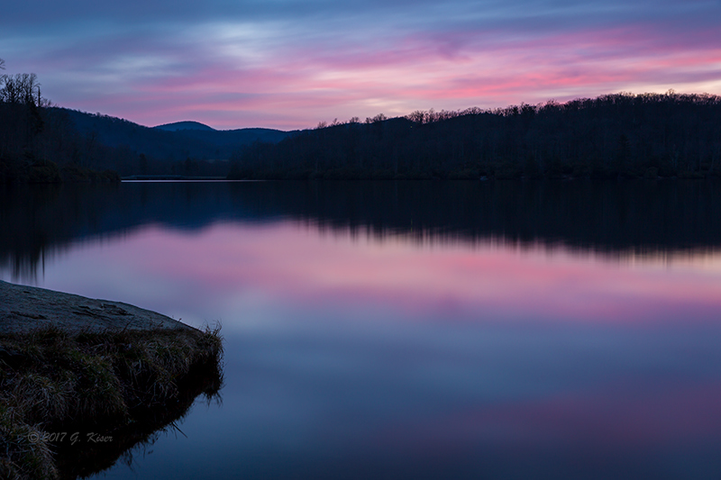
My next contestant was this one from Price Lake shot not too long after Good Day Sunshine.  It was another early morning attempt at a sunrise.  I didn't have high hopes for a lot of color when I arrived, and almost didn't get the camera out.  But, since I was there, I went ahead and put it together.  Ironically, Peace and Tranquility was a test shot to see how things would work out with a long exposure, and to dial in my depth of field.  There was hardly any color in the sky when I tripped the shutter, but when I looked at the LCD, I could see that the camera had picked up color that my eyes were not able to see.  The 30 second exposure smoothed the slightly rippled water as well.  It wasn't until I got home and looked at the picture on the computer that I really saw what I had.

I knew I had a composition that worked with an "S" curve on the left side that brought your eyes to the horizon.  That horizon came alive with the pre-dawn colors that my eyes never saw.  The water, which was glass smooth now, reflected the colors in the sky, and there was even a hint of pink in the lower right to add some visual balance to the rock that was jutting out on the left.  There was not much detail outside of variations in the shading, but there was enough to count for some texture.  Everything seemed quite soft and dreamy, and it was an overall simple image with great color tones.

While I liked this image quite a bit, it wasn't until I saw one of the previous year's winners that this image took on a different appeal to me.  The winning image was simple with overall cool tones.  It wasn't flashy, it wasn't complex, it was just there.  Because of the overall simplicity of the image here, I thought it would stand a decent chance with the competition.  I think it will excel in the creative aspects, and in the overall feel of the image.  The weaknesses will be more on the technical end.


Gnarled Centurion
As I was pouring through my images, I did a very smart thing and asked Toni what she thought.  I've come to trust her opinion on my photography more than once, and when I am at a stalemate, she is there to offer some sound advice.  A picture that I had overlooked previously was one of her favorites.  She really wanted me to enter Gnarled Centurion which was shot the weekend that Hurricane Matthew came through.  I really couldn't argue with the visual appeal here.  Since I have created the image, I have sold several prints of it, and have a 13x19" print hanging in the living room.

However, this is the picture that I love to hate.  Don't get me wrong, I love how it turned out.  It is dramatic with the sky, and the lighting is great.  The hint of fall color in the mid ground is a nice touch, and the blue in the clearing sky highlights the mountains.  So...what's not to like.  Well, I know the process that it took to get to this stage.  I really had to push the RAW file to its limits to get the color and exposure range out of this shot.  That created some technical issues that I will always see in place of the beauty of this shot.  It is an awesome picture, but I am afraid that putting it into a photo competition with a photography magazine those technical issues might be too much to overcome.

On the creativity scale, this one is off the charts.  Composition is very solid, and the exposure is definitely right for the scene.  It is dark and moody, but that was exactly what I was going for.  Will it do well in the competition, I doubt it.  But...I trust Toni's opinion, and I would love it for her if it did well since this is one of her favorites in my collection.  With her behind it, and several other of my clients who have put money on this print joining her, it would have been a mistake not to enter this picture.  If things are judged purely on impact, it will do well.


Peeling Back the Layers
Adding another one to the mix that Toni suggested is this one from a recent trip to Hawksbill Mountain.  I believe that her words were, I like that one of the rock better than the other ones you have selected so far.  Maybe I'm just used to seeing this feature at the summit of Hawksbill, and take it for granted now.  Maybe I'm still wanting more from this scene.  Either way, I had not really considered it for the competition until Toni mentioned it.  The more I though about it, the more I could see some potential to it for the contest.

Of course, what draws me to the scene in the first place are the layers in the rock which forms all sorts of wonderful leading lines.  They cause your eyes to race through the scene and off into the distance.  You can see the distant mountains to the left which adds the depth to the scene, and the clouds actually did cooperate with me.  There was a large bank of clouds over the distant mountains, while there was a break in the clouds above the ridge of the main element.  This helped to keep your attention on the rocks.  There were framing elements with the vegetation at the lower left, and the upper right.  The low sun accentuated the shadows in the layers.  Near the bottom was a nice section with earthy tones which helped to balance the early spring colors in the background.  There is a lot going on with this image, but it does work pretty well.

I think this image will excel in visual impact, and composition.  The exposure is right, and technically it is a pretty good image.  The only negative to it is that I really wanted more color in the background, and a more dramatic sky.  I just don't know if it has the "pop" to make it as a finalist with the group I'll be with.  It would make me very happy if it does well since Toni picked it out.


The Aqua Rapids
The last image that I seriously considered worthy of submitting was this one from just last week at Big Creek.  This was more of a "throw it in" image than anything else.  I loved this whole series of pictures and with them all being brand new in my collection, they all still had that "wow" factor to them.  Going on the thought that as I progress as a photographer, each set of pictures that I photograph should be better than the last.  With that though, these pictures should be better than anything that was before.  Now, I know that isn't true, as there is no real pattern to the quality of the images since there are just too many variables involved with each outing.  I was feeling very good about this last set though!

After looking at each and every one of the images, I picked them all apart, and decided on The Aqua Rapids.  It was not necessarily my favorite image from the set, but it was the one that I thought would do the best in the contest.  I wanted a nice and dramatic image since the majority of what I was submitting were more calm and serene.  The rushing water, and the shear volume of water gives this picture an instant impact.  The greens of the water make this a standout image (from this area anyway).  There was almost an electrical quality to the rapids, and that was what I was banking on.

The composition was strong with a great leading line, full of "S" Curves.  The rocks on the edges make a wonderful frame, there are dark areas at both lower corners which keep the eyes in the frame.  The trees in the background just exude lush forest, and balance with the greens of the water.  There are a lot of textures present as well.  Most of the positives I mentioned from A Bit of Drama are present here as well.  I think this one actually has a little more visual impact though.  The overall mood is different between the two which played a part in me entering both of them.  With all of the similarities, this one suffers from the same Achilles Heel as my first submission...mountain streams have been photographed many, many times.  I might be up against a bunch of similar images which will eliminate us all because none of these will stand out.


As I looked at these six images, I found it nearly impossible to eliminate any of them. They all had their strong qualities, and each had some negatives as well.  None of my pictures are perfect, but they each appeal to different parts of different people.  Each of these shots would appeal to a different person, and I'm hoping that one of them will appeal to the judges.  With that thought, I decided not to reduce my chances for a good appearance and chose to submit all six of these photographs.

At the end of the day, I'm not really expecting to win the "American Landscape" Photo Contest.  I've seen the competition that I'm up against, and they are all really good.  I would consider this a success if I make it into the finalist category.  Honestly though, I have learned a lot about myself and my photography here.  Even if I don't make it into the finals, I have bettered myself as a landscape photographer by looking so critically at my own work.  

I feel confident in saying, if I don't win, I have done my best and will hold my head high.  I'm proud of my photography, and I also know I have a lot to learn.  This is just another step on the path to my own self education.


Edit: August 7, 2017

The finalists have been announced, and unfortunately my photographs are not among them.  I make no excuses, I'm not sure of the specific reasons that I didn't make the cut.  What they were looking for was just different than what I submitted.  It was a learning experience for me, and one that I'm glad that I took part in.  I wish I had the answers to my questions so that I could learn from the experience and maybe do better next time, but I'll just have to take it at face value.  I'll continue to learn and hone my skills as a photographer and will take these chances occasionally.  Congratulations to the finalists!